Effective Ways to Choose a Blue Lotion Bottle
When a blue lotion bottle goes diva, your brand pays the price—nail the look, feel, and seal to win over picky cosmetic buyers fast.
You wouldn’t think a blue lotion bottle could stir up so much drama, but in the high-stakes world of skincare packaging, it’s kind of a diva. One wrong move—like a leaky cap or a color mismatch—and your brand’s whole vibe can fall flat. Ask any cosmetics buyer juggling deadlines and design boards: the pressure’s real when that bottle is the first thing your customer touches.
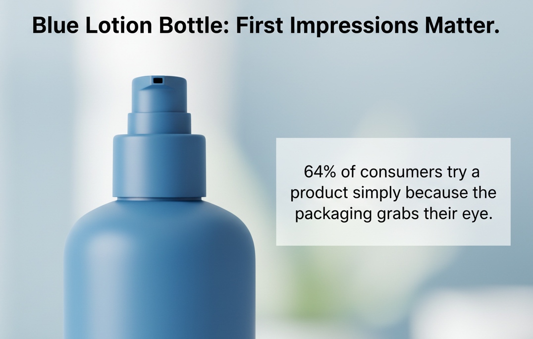
Shoppers judge in seconds. According to NielsenIQ, 64% of consumers try a product simply because the packaging grabs their eye. Translation? That bottle better look sharp, feel nice, and not explode in someone’s gym bag.
Key Points in the Spotlight: Your Blue Lotion Bottle Game Plan
→ Design Trends Matter: Soft-touch surfaces, pastel pink accents, and glossy finishes are driving consumer engagement with blue lotion bottles.
→ Eco-Friendly Materials Win: PET resin is a top pick for brands prioritizing sustainability and recyclability without sacrificing strength or clarity.
→ Closure Choices Count: From pump dispensers with O-rings to flip-top caps with silicone gaskets, leak-proof closures protect both product and reputation.
→ Finish With Flair: Whether matte texture or satin coating, surface finish influences your brand’s perceived value in the skincare aisle.
→ Size Isn’t One-Size-Fits-All: Bottle capacities from 50ml to 1 liter let you tailor packaging to fit your product category and audience needs.
→ Print With Precision: Choose between silk screen or digital printing to match your design detail and production scale requirements.
→ Ship Smartly: Foam inserts and shrink-wrapped bundles prevent leakage and damage during transport, boosting customer satisfaction.
→ Color Psychology Counts: Blue lotion bottles offer UV protection while projecting calmness, trust, and premium quality over transparent options.
Why Blue Lotion Bottle Designs Are Trending
Design trends aren’t just about color—they’re about how a product feels, tells a story, and connects with today’s values.
Soft-touch feel surfaces captivate modern consumers
A smooth bottle isn’t just sleek—it’s emotionally magnetic when it feels right in your hand.
- Soft-touch feel coatings create a velvety texture that instantly signals premium feel.
- Consumers crave more than looks—they want a tactile experience that makes the product worth holding onto.
- Especially for skincare or body care, this kind of surface adds to the ritual—turning routine into indulgence.
This trend is particularly catching on among younger buyers who equate touch with authenticity and value-added design.
Sustainable PET resin meets eco-conscious branding goals
Sustainability isn’t optional anymore—it’s expected, especially when packaging comes into play.
• Using sustainable PET resin hits two birds with one stone: cleaner conscience and standout branding. • Brands are shifting toward recycled PET, reducing their environmental impact without compromising durability or clarity in packaging.
From refillable formats to recyclable shells, blue-toned containers made from eco-friendly packaging materials are now a smart way to show you care—without saying a word.
Glossy finish and pastel pink accents on the rise
The visual combo of shine and softness? That’s what’s turning heads lately.
Short takes on what’s trending:
– A high-gloss coating amps up shelf appeal while feeling luxe under light glare. – Pairing pastel pink against muted navy or powder blue gives off that dreamy, Instagram-worthy vibe—especially in personal care aisles. – These colors aren’t random; they tap into modern color psychology where calmness meets warmth—a balance that consumers find soothing yet stylish.
It’s not just about choosing a pretty blue lotion bottle anymore—it’s about crafting an aesthetic that whispers “you’ll love me” before it even gets opened.
Materials For Blue Lotion Bottles: 5 Key Options
From sleek looks to durability, the right bottle material can make or break your lotion game. Here’s what you should know about five top choices.
High-density polyethylene
- Tough as nails but light in hand
- Super affordable without looking cheap
- Keeps its cool even when squeezed and dropped
- HDPE is perfect for everyday skincare thanks to its rugged build.
- It resists most chemicals, so no weird reactions with your lotion.
- Opaque finish keeps sunlight out—less chance of product spoilage.
• Often found in pharmacies and home goods aisles due to its reliability.
It’s not flashy, but it gets the job done—and then some. This plastic holds up under pressure, literally, which makes it a go-to choice when you want something solid but not bulky.
Short on gloss but long on trust? That’s the vibe with high-density polyethylene—a material that just works.
Polypropylene plastic
• Heat-tolerant and flexible without cracking under stress • Holds color well—your blue stays bold over time • Lightweight yet sturdy enough for travel-size bottles
- Brands love using PP because it balances form and function like a pro.
- It also fares well against essential oils and active ingredients—not all plastics can say that.
This stuff is slightly translucent, giving your product an almost frosted look while keeping things protected inside.
Need something that bends without snapping? That’s where this plastic shines—it flexes just enough while staying strong through daily use.
PET resin
Grouped by benefit:
- Appearance:
- Crystal clear like glass
- Smooth surface enhances shelf appeal
- Sustainability:
- Fully recyclable
- Lightweight reduces shipping emissions
- Functionality:
- Strong barrier against moisture
- Doesn’t crack easily under pressure
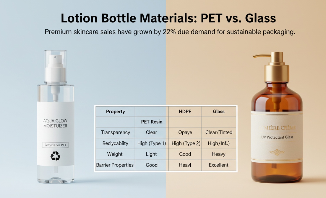
| Property | PET Resin Value | HDPE Value | Glass Value |
|---|---|---|---|
| Transparency | High | Low | Very High |
| Recyclability | Yes | Yes | Yes |
| Weight (g/cm³) | ~1.38 | ~0.95 | ~2.5 |
| Barrier Properties | Excellent | Good | Excellent |
Not only does this material keep products fresh longer, but its clarity makes it ideal for brands pushing clean aesthetics or minimalist packaging vibes around their lotion containers.
Glass material
“Premium skincare sales have grown by over 22% globally since Q4 2023, largely driven by consumer demand for sustainable and luxurious packaging,” according to Euromonitor International’s latest packaging trends report.
That stat alone explains why so many high-end products are turning back to good ol’ glass:
- It doesn’t react with formulas—zero risk of contamination.
- Gives off serious upscale energy.
- Fully recyclable and endlessly reusable if handled right.
- Heavy? Sure—but sometimes weight equals value in consumers’ eyes.
You’ll often see amber-tinted versions used too—they protect formulas from UV light while keeping that luxe feel intact.
Acrylic polymer
Multi-item bullet grouping:
- Visual appeal:
- Ultra-glossy finish mimics glass
- Clear body lets product shine through
- Durability:
- More resistant to drops than actual glass
- Doesn’t yellow over time like cheaper plastics
- Practicality:
- Ideal for countertop display items
- Used widely in cosmetics packaging
This one straddles the line between showy and practical—it looks high-end but won’t shatter if knocked off the sink edge at midnight.
If you’re eyeing something with style points minus the fragility, acrylic might be your best bet among materials used in crafting sleek blue-toned lotion vessels like those offered by Topfeelpack (just once!).
5 Steps To Select Blue Lotion Bottle
Choosing the right packaging isn’t just about looks—it’s about functionality, vibe, and how your product fits into people’s daily routines.
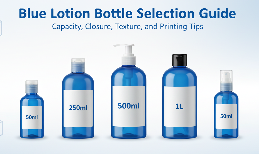
Finding the perfect capacity: 50 milliliter to 1 liter
Small? Handy. Big? Long-lasting. Here’s how to pick:
- 50 milliliter bottles are ideal for travel-size products or high-end serums.
- Mid-range sizes like 250ml and 500ml suit everyday moisturizers.
- Larger formats—up to 1 liter—are great for family-use lotions or salon supplies.
According to Mintel’s Global Packaging Trends Report (2024), “Consumers now expect size options that match their lifestyle—from gym bags to bathroom counters.” So don’t guess—match volume with usage habits.
Matching closure options like pump dispenser or flip-top cap
Different closures = different vibes. Choose based on ease and purpose:
• A pump dispenser works best for thicker lotions—no mess, no waste. • A flip-top cap, though? Perfect for lighter formulas and quick grabs. • Twist-off caps offer security but can annoy users in a rush.
Always test closure compatibility with your formula’s viscosity. That extra click or press makes all the difference when customers reach for their favorite blue-toned bottle.
Selecting a glossy finish or matte texture for appeal
A bottle’s surface says more than you think:
- Glossy finishes reflect light, making colors pop—ideal if you want your product screaming “premium.”
- A soft-touch matte texture, on the other hand, gives off a modern, minimalist feel.
- Combine both textures on one bottle? Now you’re playing in boutique territory.
The right finish doesn’t just catch eyes—it tells people what kind of experience they’re buying into before they even open it.
Choosing silk screen printing or digital printing technology
| Printing Type | Best For | Cost Efficiency | Design Flexibility |
|---|---|---|---|
| Silk Screen | Simple logos & solid colors | High (bulk) | Low |
| Digital Printing | Complex gradients & graphics | Medium | High |
If you’re going bold with visuals on your lotion container, go digital—it handles detail like a champ. But if you’re batch-producing with just one logo color? Classic silk screen keeps things sharp and budget-friendly. Match your print style with brand personality—and production volume.
Ensuring secure shipping with protective foam inserts
Nobody wants cracked caps or leaky lotion arriving at their door:
- Use custom-cut protective foam inserts tailored to your bottle shape.
- Add corrugated dividers between bottles during transit.
- Wrap each unit individually if you’re shipping glass versions.
- Test-drop samples before full-scale delivery runs.
These little tweaks can prevent breakage disasters—and save you refund headaches later. Plus, unboxing something perfectly intact always scores points with customers who care about quality presentation.
Blue Lotion Bottle Vs Transparent Bottle
Choosing between a colored or see-through container? Let’s break down what makes each one tick and how they shape your product’s vibe and shelf life.
Blue Lotion Bottle
A blue-toned bottle isn’t just about looks—it’s a smart packaging decision packed with perks:
- UV protection keeps sensitive creams and serums from breaking down under light exposure.
- That rich hue boosts aesthetic appeal, giving off a premium, spa-like vibe.
- The subtle opacity helps with product preservation, especially formulas that react to air or sunlight.
- Brands often use the blue tint as part of their core brand identity, creating instant recognition on shelves.
- The addition of blue pigment in the packaging material also masks discoloration over time, keeping the product looking fresh.
- For products heavy on botanicals or natural oils, this kind of container reduces oxidation risks thanks to its light-filtering nature.
It’s not just about hiding what’s inside—it’s about protecting it and making it look good while doing so.
Transparent Bottle
Some folks want to see exactly what they’re buying—and that’s where clear containers shine:
• Shoppers love visibility—being able to eyeball texture, color, and consistency builds trust fast. • A transparent design elevates the overall product display, especially when the formula has shimmer or vibrant tones. • But here’s the kicker: these bottles offer zero defense against light, meaning higher risk of ingredient degradation.
Still, there are upsides:
- They’re often more cost-friendly due to simpler production processes—hello, cost effectiveness.
- Minimalist brands love them because they scream clean beauty and transparency in every sense.
If you’ve got a stable formula that doesn’t mind some sun and you want your customers to fall in love at first glance, clear might be your move.
For both styles—whether you’re going bold with blues or keeping it crystal clear—Topfeelpack offers packaging options that balance style with function like a pro.
Avoid Leakage: 3 Blue Lotion Bottle Solutions
Three simple packaging upgrades can save your product from messy leaks and customer complaints. Here’s how to keep every drop where it belongs.
Using pump dispensers with built-in O-rings
When it comes to preventing leaks in lotion bottles, few upgrades are as effective as pump dispensers equipped with built-in O-rings. These tiny rings might not look like much, but they pack a punch when it comes to sealing power.
- Built-in O-rings create a tight seal between the pump head and bottle neck, blocking air and liquid movement.
- The flexible material adapts to micro-gaps, reducing pressure loss during shipping.
- They help maintain the integrity of the dispensing mechanism, ensuring smooth flow without drips or clogs.
- Ideal for both viscous and lightweight formulas—think creams, gels, or even watery lotions.
- Compatible across various bottle neck sizes, offering versatility in packaging design.
- Reduces product waste by eliminating backflow after each use.
For brands aiming to boost customer satisfaction while cutting down on returns due to leakage, this upgrade is a no-brainer.
Integrating flip-top caps with silicone gaskets
Sometimes it’s the little things that make all the difference—like adding silicone gaskets inside flip-top caps on your favorite blue-toned lotion containers. This combo doesn’t just look clean—it keeps things clean too.
• A soft yet durable silicone gasket forms an internal barrier that hugs the cap shut. • It works hand-in-hand with locking grooves in the cap design for double protection against spills. • Users get controlled dispensing—no more squeezing out too much or fighting dried-up residue at the nozzle.
The beauty here lies in simplicity: easy open-and-close action paired with reliable sealing performance.
According to Mintel’s 2024 Skincare Packaging Report, “consumer trust increases by 27% when products demonstrate leak-proof reliability.” That’s reason enough for brands to rethink their closures—and for users to appreciate those extra design details every time they toss a bottle into their gym bag or carry-on.
Implementing protective shrink-wrapped bundles
Think of shrink-wrap like bubble wrap’s sleeker cousin—it doesn’t just protect; it seals confidence into every shipment of your go-to moisturizer or hand cream packed in a sleek blue container.
- Heat-applied film tightly wraps around multiple lotion bottles, holding them firmly together during transit.
- Prevents accidental twists or flips that might pop open lids mid-shipment.
- Adds a layer of tamper-evidence—customers know their product hasn’t been messed with before delivery.
Whether you’re shipping across town or across continents, this method keeps everything snug and spill-free until it lands safely on someone’s shelf.
Should You Choose A Blue Lotion Bottle?
Picking the right container isn’t just about looks—it’s about how it feels, performs, and sells.
Will opaque blue bottles reinforce your brand identity?
Choosing opaque blue bottles might just be the trick to make your product pop on crowded shelves—if it vibes with your story. Here’s what to weigh:
• Brands rooted in calmness, trust, or wellness often benefit from shades of blue—color psychology links it to peace and dependability. • If you’re targeting a premium market, deep navy tones can scream sophistication while still feeling approachable. • Transparent packaging often suggests purity, but opaques can shield sensitive formulas from UV damage—form meets function.
A report from NielsenIQ in early 2024 noted that “consistent visual branding across packaging increased consumer recall by up to 33%”—a nudge toward reinforcing your look through color choice.
Topfeelpack offers creative customization for brands seeking more than just off-the-shelf solutions.
Soft-touch feel vs satin coating for your target audience
When it comes down to touch and feel, customers notice more than you think. Choosing between a soft-touch feel or a satin coating depends heavily on who you’re selling to:
For younger buyers chasing aesthetics:
- Soft-touch = modern + Insta-worthy
- Satin = subtle elegance
For eco-conscious crowds:
- Satin coatings often use less material
- Soft-touch finishes may require synthetic rubbers
For luxury-focused consumers:
- Soft-touch screams indulgence
- Satin leans toward minimalist chic
Each finish affects how customers perceive quality—and that perception sticks long after they’ve tossed the box.
Balancing cost: PET resin, polypropylene plastic, and glass options
Managing material costs without compromising quality is part art, part science—and all about strategy. Here’s how smart brands juggle their choices:
Step 1: Compare base costs of materials. PET is affordable and recyclable; great for mass production. Polypropylene is tougher but slightly pricier. Glass? Elegant but heavy and fragile—shipping adds up fast.
Step 2: Match material with formula needs. Thicker lotions? Polypropylene holds shape better. Sensitive serums? Glass protects purity best. Everyday moisturizers? PET does the job on a budget.
Step 3: Think beyond price tags. Durability impacts returns. Weight affects shipping rates. Recyclability shapes consumer trust.
Getting this mix right can boost both margins and loyalty—because when packaging works harder for you, so does every dollar spent.
FAQs about Blue Lotion Bottle
What makes a blue lotion bottle more attractive on the shelf than a clear one? A blue bottle doesn’t just hold lotion—it tells a story. That deep, rich hue suggests calm, care, and a whisper of luxury. It also protects delicate ingredients from sunlight, which can break down formulas over time. When paired with soft pinks or metallic accents, the contrast is irresistible. It’s not just packaging—it’s personality.
Which closures work best for different lotion textures? Texture matters. The way a lotion feels should match how it’s dispensed:
- Lightweight lotions: Flip-top caps keep things quick and clean.
- Thicker creams: Pump dispensers with O-rings offer control without mess.
- Oils or serums: Droppers or twist caps give precision where it counts.
Each closure isn’t just functional—it shapes the experience.
Why do so many brands choose PET resin for their blue bottles? PET isn’t just strong—it’s smart. It holds its shape, resists shattering, and still feels light in the hand. For brands producing thousands of units, PET keeps costs down without sacrificing quality. And for customers who care about the planet, its recyclability makes a quiet but powerful statement.
Can a soft-touch finish really influence someone’s decision to buy? Absolutely. That velvety surface does something subtle but powerful—it invites touch. It feels warm, almost skin-like, which instantly connects with the product inside. Combined with a matte blue tone, it signals care and comfort, drawing people in before they even read the label.
What bottle sizes make sense for different customer needs? People’s routines vary, and so should your bottle sizes:
- 50ml or 100ml: Perfect for purses, gym bags, or weekend trips.
- 200ml: The everyday go-to—fits in a bathroom cabinet, lasts a while.
- 500ml or 1L: For families or loyal fans who don’t want to run out.
Offering a range isn’t just practical—it shows you understand your customer’s life.